How to apply these theories inside the bathroom
Chromotherapy, color analysis… We all know what the first one is, we’ve been hearing about it for years; the idea that the colors that surround us can have an influence on our mood and well being has been coming and going in and out of fashion. Color Analysis is a fairly new science though, and for many it can also be something completely new. To sum it up, it is based on a couple of factors, that allow experts to give each person a color palette (or a season, as the groups have the names of the seasons): in order to always look our best we should follow these set of colors, which can be applied to makeup, clothes and accessories. Some still haven’t realized that it can be applied to our homes, too and TDA, with its wide range of colors, can give you the right tools to create a bathroom that can be defined as “in palette”.
Back to the basics
One of the fundamentals of color therapy is temperature. There are warm or cold colors and this goes way beyond the simple idea that red is a warm color and blue is cold. For every color there are cold and warm hues and the general idea is to avoid putting the two together, in fashion as well as when we are furnishing our homes.
How to pair colors inside the house
Color analysis can be applied inside our home too to create a mix of colors that make us feel good, they can represent what we like and they can belong to our same “season”. It’s always a good idea to have furniture, accessories and details that follow the rules of this new science. TDA’s color spectrum has always offered a lot of different choices and this year the choice is even broader, with new pairings, mixes and hues.
How to create the perfect mix of colors in the bathroom
The Italian expert in color analysis, the well-known Rossella Migliaccio, founder of Image Institute, always advises to avoid giving in to the temptation of choosing only one color and do a sort of copy + paste all over our room (or house!). The author of the best selling book “Armocromia” advises her readers to choose a dominant color and use it with others that suit it best, a minor and a complementary color, and to create the perfect mix.
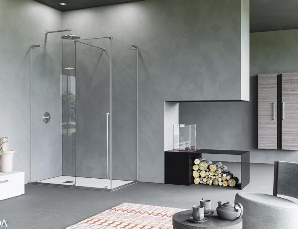
Do you want a bathroom that inspires both peacefulness and serenity? Then choose lighter, neutre colors like White, Latte, Nude, Fancy Autumn Beige and Titanium and pair them with smooth surfaces and textures that, thanks to the help of carefully placed mirrors (read our blog post about it), will make your bathroom look wider and better.
Your goal is a joyful room, that will help you start your day with a sprint and a smile? Then you’d better choose red accessories and furniture for an energizing look. It’s also said that the color red can have positive effects on both body and mind, it can soothe pains and improve blood pressure. Also like orange is said to have a positive effect on our mood: it makes us feel instantly happier and more optimistic.
Let’s have a look at some combination
A red composition, with a white Giusto.Haiku front panel is perfect for a Winter bathroom, it’s modern and it oozes energy.
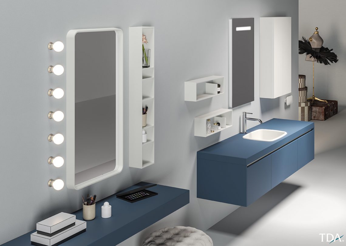
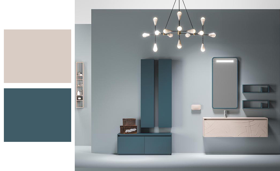
In the following picture the color Turquoise and Ballerina provide a more sophisticated look; the first is trendy the second neutre, a perfect mix. It’s also the perfect combination for all those Autumns, who feel that a wardrobe in palette is never enough.
Autumn 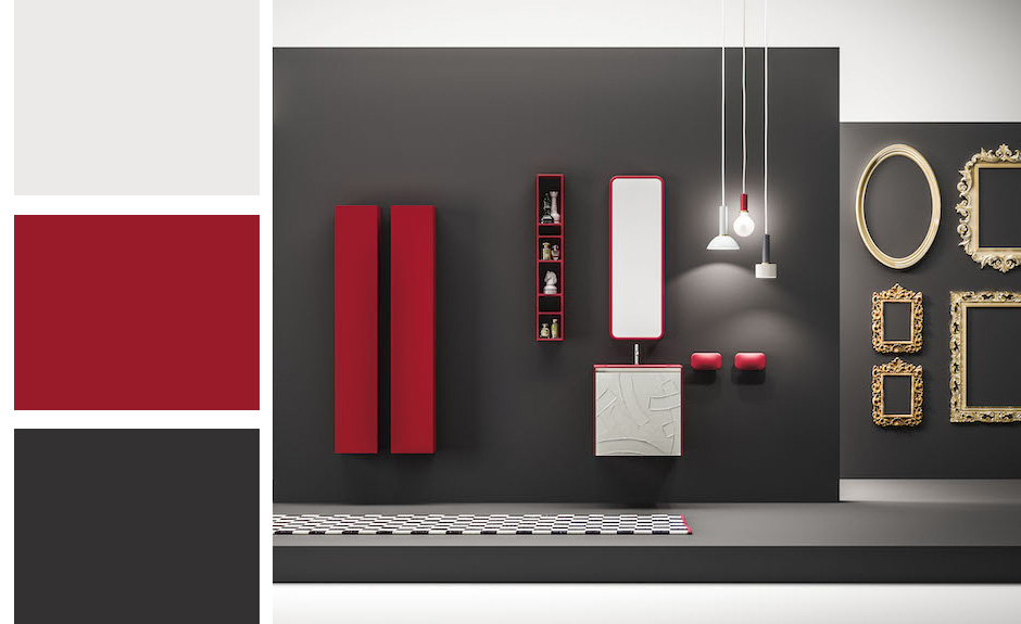
Winter
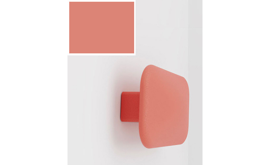
Even the smallest of details matter to give a nice touch of color to a room. Like this highly functional and versatile hanger, one of our accessories made of Arock®. Here you can see it in a fresh and light hue, perfect for those who want a bathroom from the Spring palette. If your goal is to create summery look, then choose Leale, with this color, Ocean, and combine it with the softer tones of these Venetian.
All you need to do is let yourself be inspired by TDA’s color palette.